Rent It!
Rent It! is a mobile application designed to simplify and streamline the property rental process.
Role: Design, User Research & Testing, Facilitating
Tools: Mural, Figjam, Figma
Timeline: 3 Weeks

Rent It! is a mobile application designed to simplify and streamline the property rental process.
Role: Design, User Research & Testing, Facilitating
Tools: Mural, Figjam, Figma
Timeline: 3 Weeks
"Rent It" is a mobile app designed to simplify house hunting in new neighborhoods. It allows users to find new property listings, schedule viewings, and arrange meetings with property managers. The app aims to streamline the entire process, making it easier and more efficient for users to find their ideal home.
To create a digital solution to better serve individuals searching for rental properties in new neighbourhoods by streamlining the process of finding listings, scheduling viewings, and meetings with property managers, making house hunting efficient.

Our research of multiple competitors revealed key insights and gaps, notably the lack of direct contact with property managers.

We interviewed people who were newcomers to Ontario about their house hunting experiences. Participants frequently described the process as exhausting, and overwhelming. Most of them expressed difficulty in connecting with property managers and scheduling meetings and viewings. Some had to commute long distances for viewings, often encountering no-shows or cancelled appointments, leading to wasted time and energy.
What do people feel?

What do people value?

The research findings pointed towards the need for direct contact with property managers, better accountability, and a formal scheduling system to simplify and improve the process. Recognizing the importance of this feature, we prioritized scheduling meetings with property managers in our design solution to streamline the house hunting process and enhance user convenience.
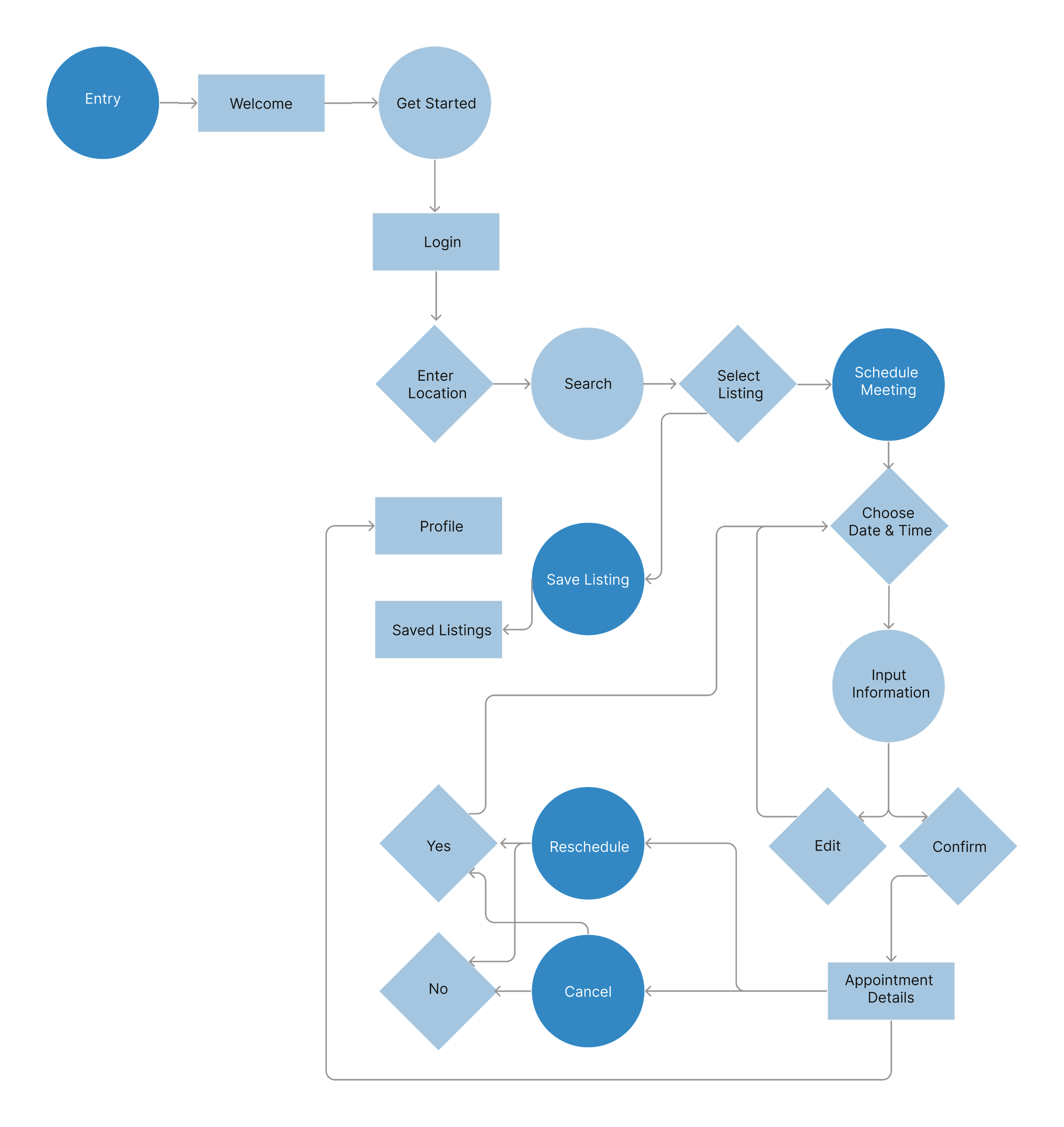
The research findings led us to craft the user flow.
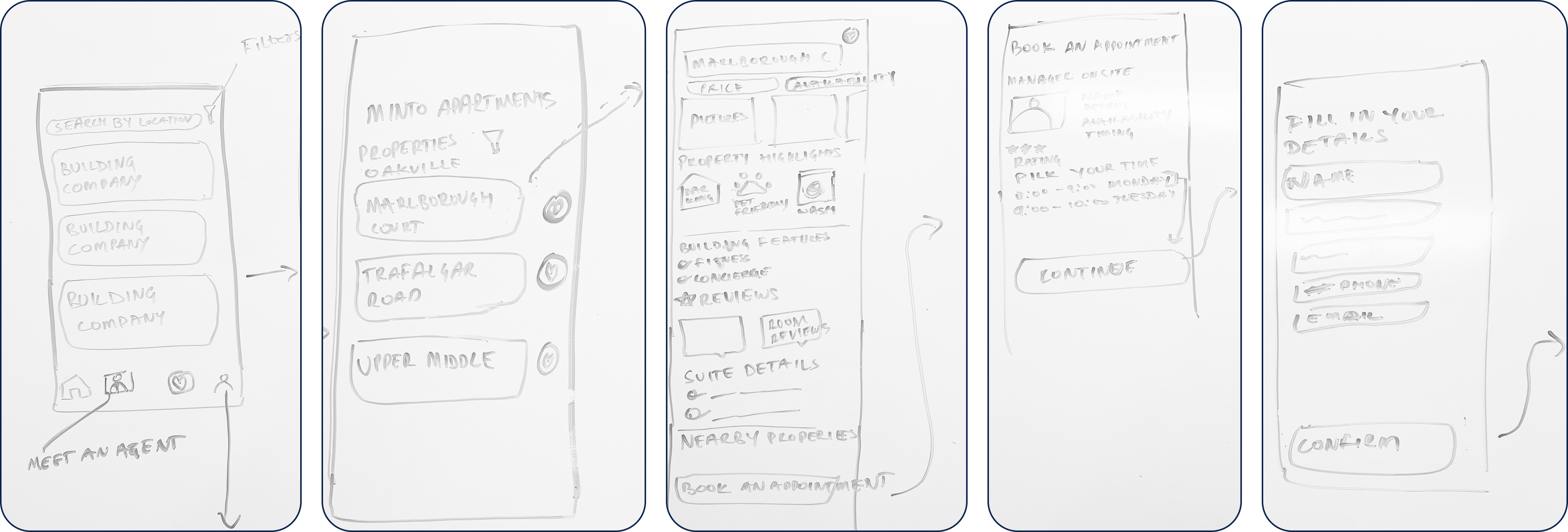
We worked on some low-fi sketches of the screens. These detailed out the initial flows of searching for properties & booking appointments with the manager.
Before we moved forward with the design, we conducted the first round of user testing asking 5 users about the user flow of the application, it’s features and screens as well.
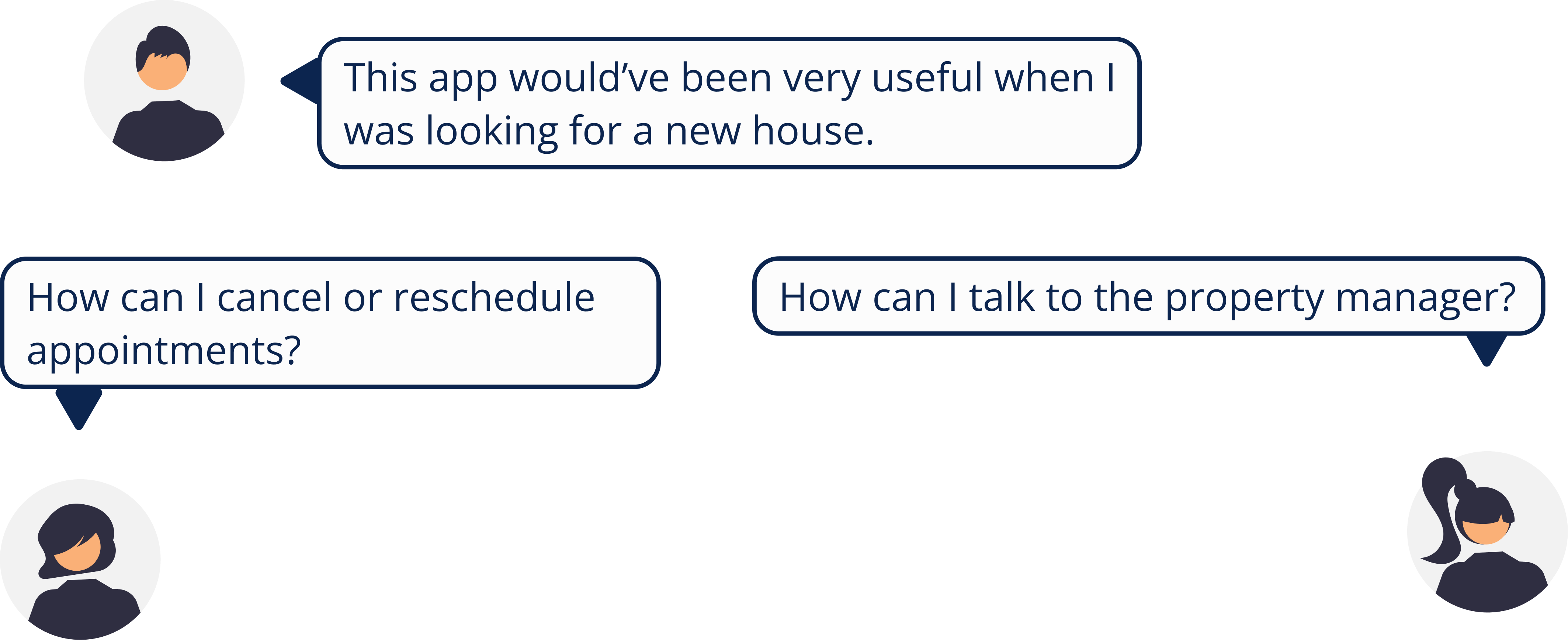
What did the users say?
Based on the feedback from the user testing, we concluded that:
We tested the mid fi wireframes by asking another set of 5 users to complete a couple of tasks in the application followed up with some open-ended questions to collect their thoughts about the experience.
What did the users say?

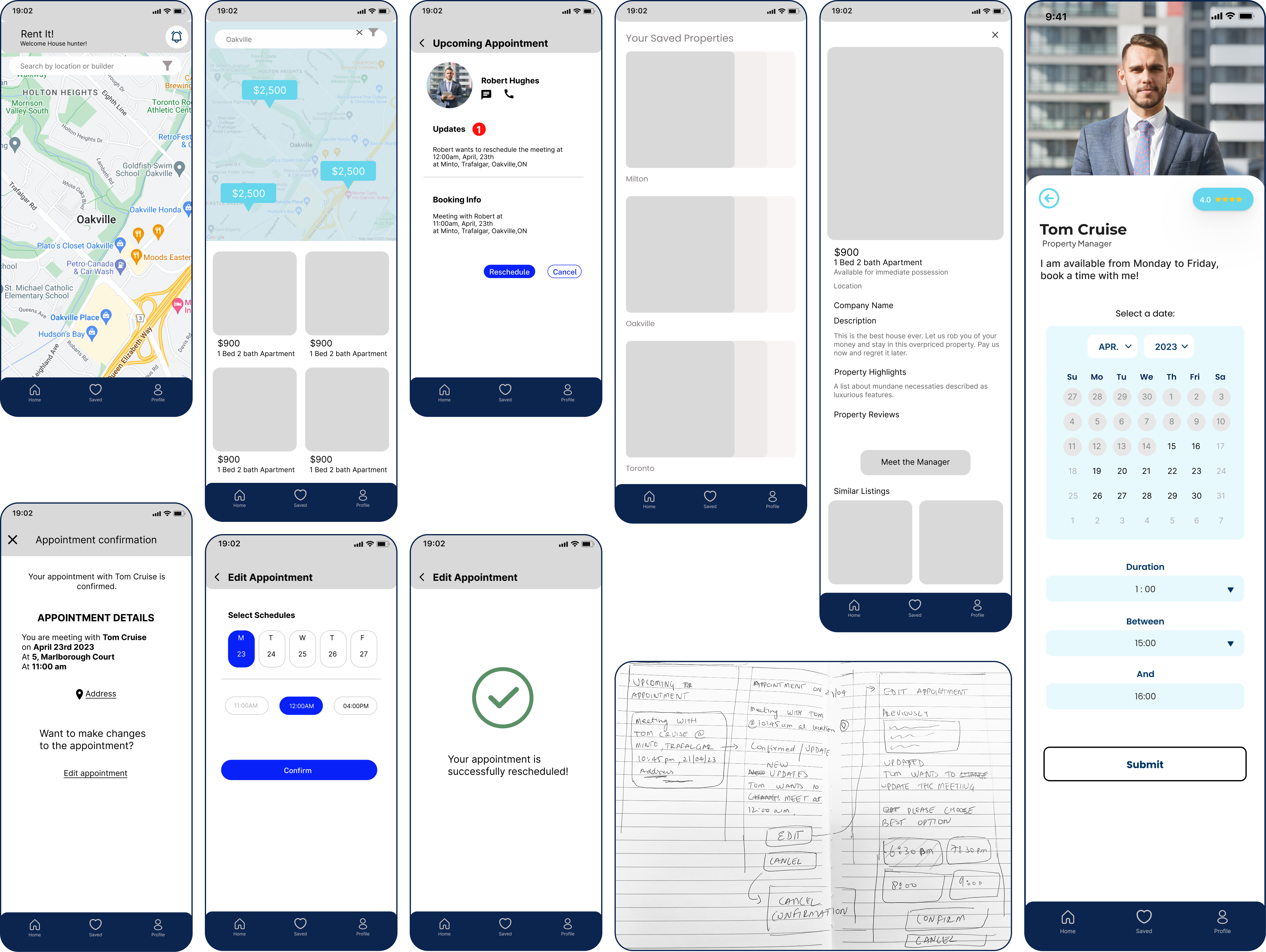
All the users were able to book and reschedule an appointment without any problems. People liked the overall experience of the application.Some also stated that it was easy & Intuitive to use.

Considering the short amount of time we had for this project, we all think that the resulting application design was a good outcome. However, if we had more time then we would definitely consider some additional tweaks and additions to the application. Specifically, including a 'Discover' screen in the application where all the properties could be listed. Also, we would also like to detail out the flow for the property managers.
Thanks.

